The short answer: choose the kind of variation you enjoy
Choose limewash if you want a brush-led, softly varied appearance and are willing to investigate the care requirements of the exact system. Consider Portola’s Roman Clay if you prefer a troweled, plaster-like finish on a suitable smooth interior wall. Choose a conventional interior paint when your priority is a comparatively uniform field of color and you want to compare products by sheen, cleaning instructions and future maintenance. None wins in every room.
The more useful question is what you want to notice a year after the work is finished. Is it the movement across an uninterrupted wall, the way the surface meets a wood cabinet, or the fact that an everyday mark can be dealt with without anxiety? Answering that first keeps a beautiful reference photograph from becoming an unsuitable specification.
This is a selection guide for US homes, not an application tutorial or a product test. Roman Clay refers here to Portola’s named finish; limewash products and conventional paints are not interchangeable systems. Verify the current instructions for the actual product, existing surface and intended room.
Why textured walls deserve a closer look now
Houzz’s May 2026 US emerging trends report identified growing interest in tactile wall finishes, including limewash and Venetian plaster, using searches on its own platform from January through March. That is a useful editorial signal, not a measurement of today’s Google demand or a reason every home needs a textured wall.
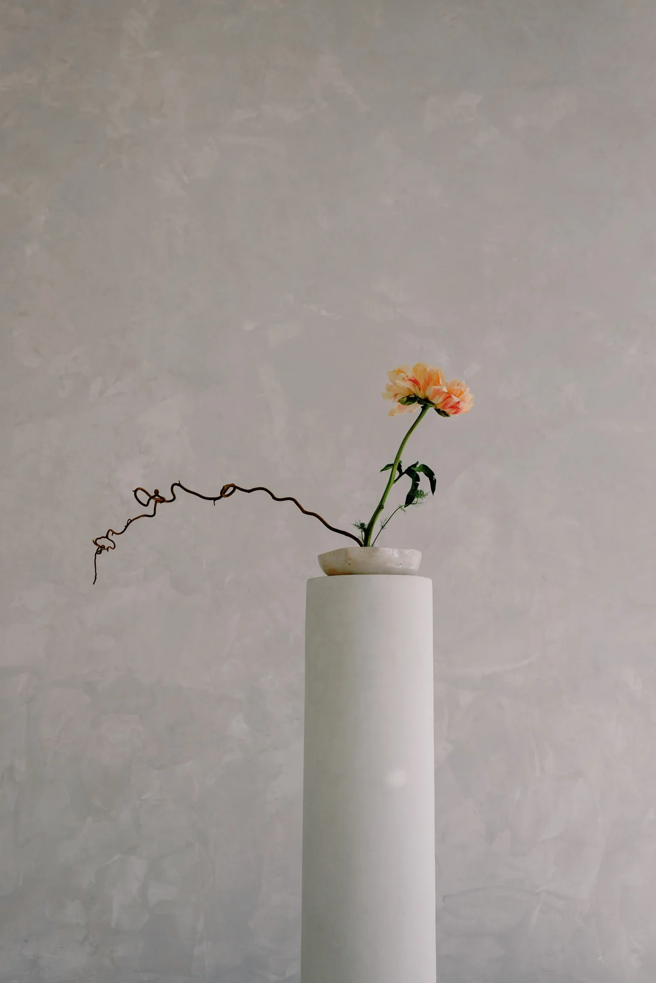
The attraction is easy to understand when you put a wall beside things you already own. A restrained chair, woven fabric and a plain ceramic vessel can make a varied background feel like part of a composition. Equally, a busy rug, strongly veined stone and multiple timber tones may already provide all the visual activity a room needs.
Try describing your reference image without naming its paint. Perhaps you like the low contrast, the broad area of uninterrupted color or the side lighting. Those qualities can guide several different finish choices. Keep the trend as a prompt to look carefully, then let your own room decide how much of it belongs.
Limewash: when a brushed surface is the point
Portola describes its Lime Wash as a lime-based, brush-applied finish with color variation. The appeal is movement rather than a perfectly even patch of color. Its guidance also makes clear that appearance varies with the color and application. Treat the manufacturer’s photographs as possibilities, not a promise that a particular wall will look identical.
Before choosing it, ask yourself whether you like variation across an entire room or only in a tightly framed detail. A close-up can look wonderfully atmospheric while saying little about four walls, a low ceiling and several door openings. Collect a room-scale reference as well as a detail and explain what you like in each.
An appropriate sample should help resolve your tolerance for visible changes in tone. Would a strong patch behind the sofa feel intentional to you, or would you keep seeing something that needs correcting? There is no fashionable answer to that question. If you want an even color with little movement, say so before asking an applicator to reproduce an intentionally varied finish.
Roman Clay: look at the marks, not just the color
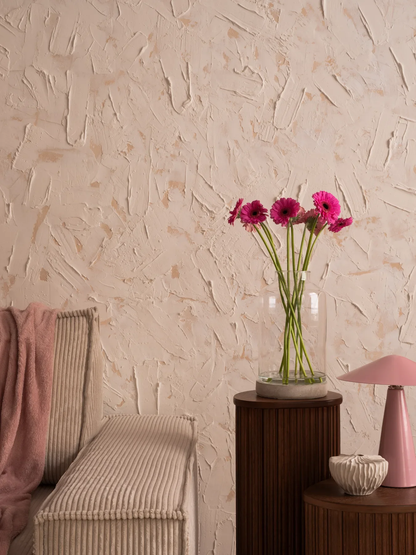
Portola describes Roman Clay as a paint and plaster hybrid for smooth interior walls, applied in overlapping layers with a putty knife or trowel. The resulting character differs from a brush-applied wash. Compare the size and direction of the visible movement instead of assuming that two warm beige finishes will produce the same effect.
Ask the person preparing the sample to show the visual language they expect to use across the room. You may prefer broad, quiet passages over a dense pattern of smaller marks. Put that preference in ordinary words and keep the approved sample available. A color name alone cannot communicate the hand of an applicator.
It is also worth looking at a corner and an interruption. How will the finish stop at a door casing, turn around a return or meet a built-in? These are questions for the proposed scope, not proof that one material is superior. The best sample conversation connects the large field of the wall to the small places where you will see the workmanship every day.
Conventional paint still belongs in the conversation
A uniform painted wall can be a deliberate design decision. It can give artwork, books and furniture a quieter background without asking the wall itself to carry the room. Compare a carefully chosen conventional paint alongside specialty finishes rather than treating it as the fallback after the interesting options have been discussed.
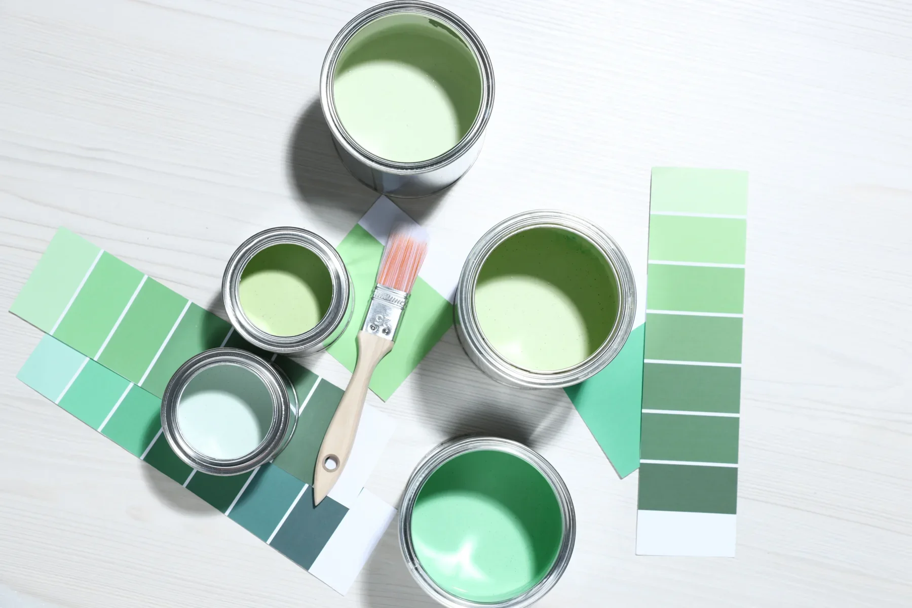
Benjamin Moore explains sheen as the amount of light reflected by a painted surface and distinguishes flat, matte, eggshell and other finishes. Its guidance also shows why the word matte alone is not a complete performance specification: suitability and cleaning characteristics depend on the actual product. Ask for those details instead of relying on a blanket rule that every flat paint is fragile or every eggshell is right for every room.
Place a candidate painted sample beside your proposed specialty finish. Look for the difference you genuinely value. If the room already has expressive textiles, a sculptural light and a prominent view, the more uniform option may make the overall composition easier to enjoy. Restraint does not need an apology.
Read the wall in the room’s actual light
Stand at the entrance, sit where the sofa will go and look along the wall from a window. These are three different ways of seeing the same surface. Use them as a review exercise rather than judging the entire decision from a phone held close to a sample.
Keep a short observation record: morning daylight, afternoon daylight and the lamps you use after dark. Write down what you notice at each visit. Does the wall feel too busy beside the curtains? Does the color separate from the floor in a way you enjoy? Would a different furniture arrangement change which part of the wall attracts attention? A sequence of observations is more useful than asking whether the color is simply right.
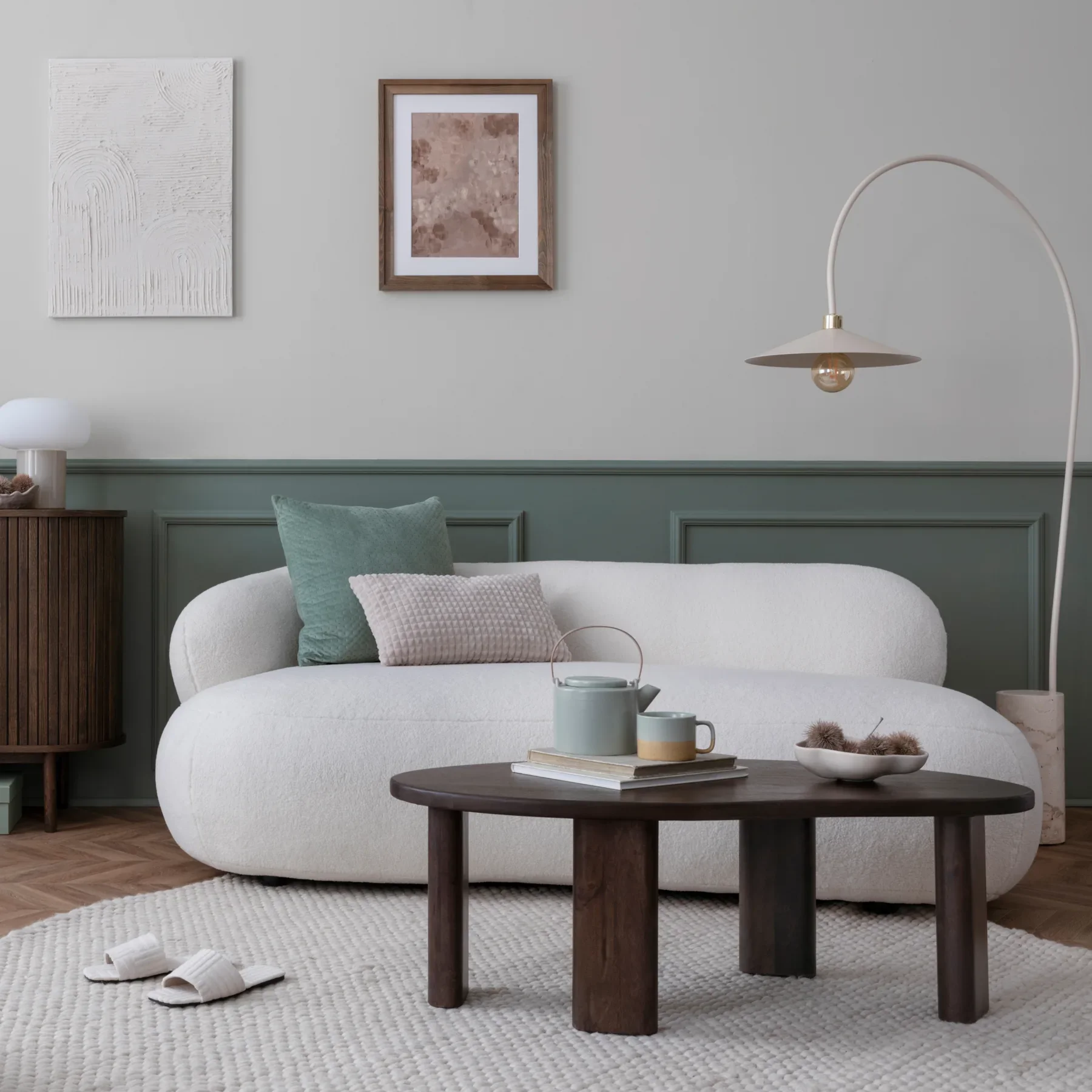
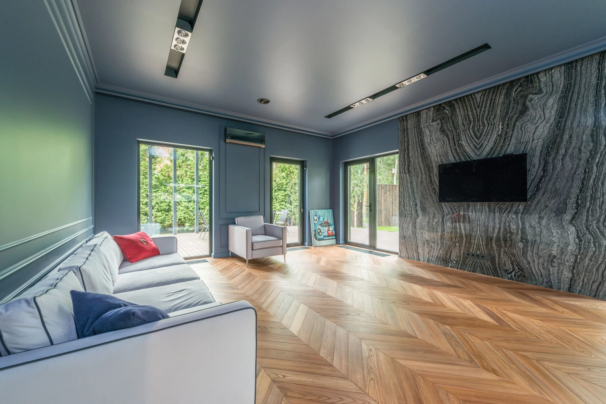
The room photograph below is an illustration of relationships between a wall, furniture and light. It is not evidence of a particular coating or an Archmora installation. Use it to frame the question, then make the decision with samples in your own space.
If the lighting plan is still unresolved, settle the intended evening arrangement before approving the final surface. Changing several variables at once makes the comparison harder to interpret.
Ask what the existing wall will require
Before discussing a finish as a purchase, identify the existing wall and its condition with the person responsible for the work. Painted drywall, a repaired surface and exposed masonry should not be treated as equivalent starting points. Request a written preparation proposal tied to the exact manufacturer system.
For example, Portola specifies its Limeproof undercoat for drywall when using its Lime Wash. That is product-specific guidance, not a general primer instruction for every limewash on the market. A seller should be able to point to current documentation that applies to the system being quoted.
Make unknowns visible in the scope. Record who will assess existing coatings, repairs and suitability, and what happens if the wall needs additional work. A beautifully presented color sample does not answer those questions.
For a pre-1978 US home, pause before disturbing existing paint. EPA explains that renovation can create hazardous lead dust and recommends a lead-safe certified contractor for this work. Check the applicable federal, state and local requirements with a qualified professional. This guide does not provide sanding, stripping or lead-removal instructions.
Cleaning is a specification, not a reassuring adjective
Imagine the actual contact points: a chair back near the wall, a bag set down by the entrance, the place a hand reaches beside a switch. Mark those locations on your room sketch. You are not trying to predict every accident; you are deciding where maintenance matters most.
Portola identifies a sealer for making its Lime Wash wipeable and describes a separate Roman Clay Topcoat that adds protection and some sheen. These are different products within specific systems. Do not translate that information into a claim that all sealed decorative finishes behave alike.
Ask the supplier for the cleaning method, any waiting period before cleaning, and the implications of the proposed protective coating. Then approve the complete sample, including that coating where specified, rather than approving an unsealed appearance and adding the care decision later.
Keep the distinction between wipeable and waterproof clear. Do not assume that a decorative wall finish is an approved shower system, backsplash or remedy for dampness. Where water exposure is part of the project, obtain written suitability information from the manufacturer and have the assembly assessed by the project professional.
Use three room scenarios to narrow the shortlist
Picture a living room with a large blank wall and a small group of calm furnishings. If the wall is meant to be part of what you look at, both a brushed wash and a quieter troweled sample deserve attention. Compare their movement at room scale, with the same fabric and floor samples beside them. Conventional paint remains a useful control for the comparison.
Now picture an entry where coats, bags and moving furniture regularly come close to the wall. Start the conversation with contact, cleaning and repair. You might still choose a specialty finish, but make the maintenance plan a condition of the choice rather than something to discover afterward.
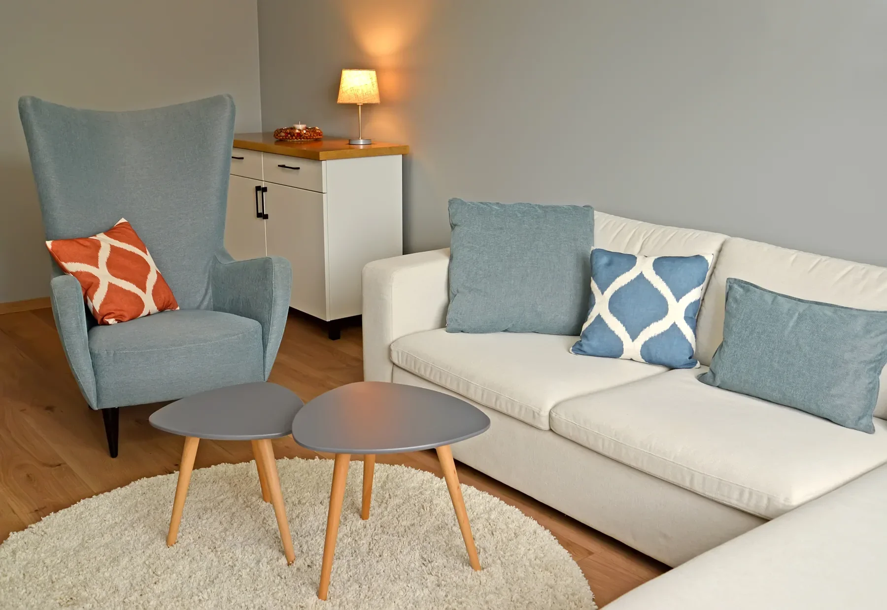
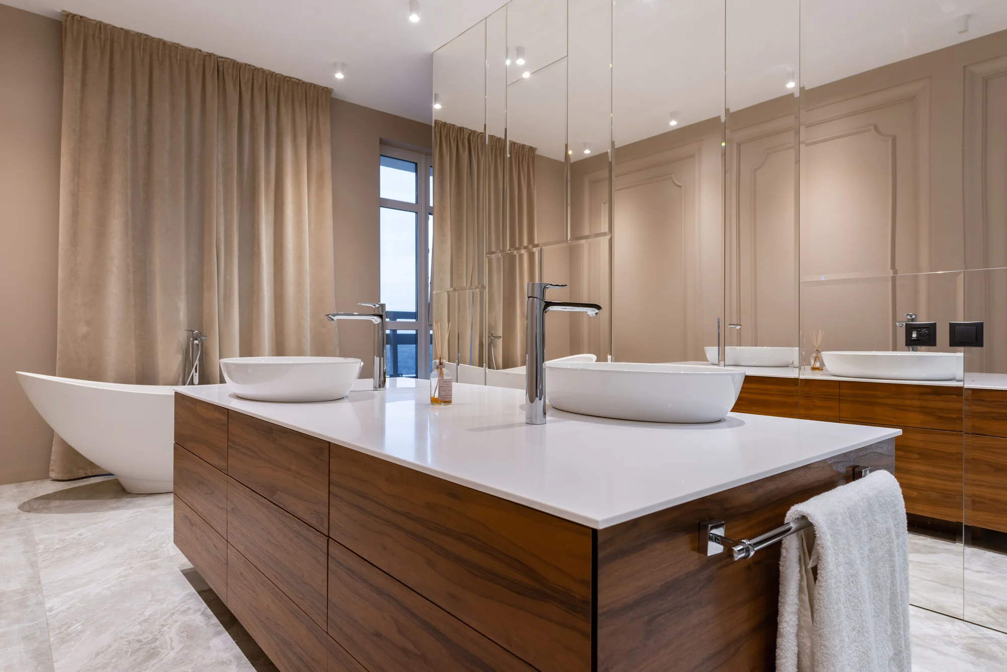
Finally, imagine a bathroom wall near a vanity. Separate the appearance you want from the actual exposure and assembly requirements. The photograph below illustrates a material relationship only; it does not identify a coating or establish suitability for another bathroom. Ask the project team which complete system is appropriate before narrowing colors.
Make a sample appointment worth having
Give each sample a name that includes the manufacturer, product, color and proposed protective finish. Add the date and the person who prepared it. Keep the full system identifiable so that an attractive board does not become disconnected from the eventual order.
Bring the things the wall will actually meet: a piece of the curtain fabric, a flooring sample, a cabinet finish or an object you plan to keep. Avoid evaluating an entire room against a tiny collection of unrelated swatches. Ask whether the background supports the materials that matter most.
Request enough visible area to judge the intended movement, and agree with the applicator how representative the sample is. Review the sample after the manufacturer’s stated drying or curing requirements have been met. The size and timing should suit the product and project; there is no universal board dimension or overnight approval rule here.
Choose one person to record the decision and photograph the approved arrangement for reference. The photograph supports the record; the labeled physical sample and written specification remain the more useful conversation tools.
Let the furnishings help you decide how much texture is enough
Set a simple object against the sample and step back. Notice whether you are looking at the object, the wall or the meeting between them. You may want all three to contribute, but they do not have to speak at the same volume.
A useful exercise is to identify a lead element and two supporting elements. For instance, the wall might be the lead while a quiet upholstered piece and a plain vessel support it. Or the furniture may be the lead, with a comparatively even wall holding the composition together. These are optional design exercises, not rules about how a stylish room must look.
If every sample begins to feel demanding, remove an element from the comparison before adding another finish. Often the unresolved question is how much visual information you want to live with, rather than which supplier offers the most interesting product. Keep room for the things you already value.
Compare the complete quote and the future repair conversation
Ask each quotation to describe the same area and starting condition. List preparation, specified products, samples, protection of the room, application, any approved topcoat and completion expectations. This creates a basis for comparing scope without inventing a national installed price for a project no one has inspected.
Ask what is excluded and who approves additional work. A lower total may reflect a different preparation allowance or a missing protective layer rather than a more economical version of the same result. Resolve the difference in writing before treating the totals as comparable.
Then ask an unusually useful question: what would you recommend if this wall needed attention later? Request the supplier’s repair or recoating guidance and the model of care the applicator expects. Keep color references, batch information where available and the final system specification together. Do not assume any finish will produce an invisible spot repair.
There is no material order to place until the important uncertainties have an owner. A clear unanswered question is more useful than a confident-looking mood board that hides it.
Your decision, in one paragraph
Try completing this brief: We want this wall to feel calm at room scale, with visible variation only where we have approved it in a sample. The room has these contact and cleaning needs. Our existing surface still needs this assessment. We are comparing these complete products and finishes, and this person will confirm preparation, suitability and care before the order.
If you cannot complete a sentence, that is the next task. If you can, you have something more useful than a folder of beautiful walls: a decision that another person can understand and help deliver.
For the wider room, continue with Archmora’s material-palette and room-lighting guides in the references below. Use the project-brief tool to organize scope questions, then return to the samples with fewer unknowns. The aim is a wall you enjoy living beside, including on an ordinary afternoon when nobody is taking a photograph.
Questions worth resolving before you order
Can limewash go over an already painted wall? The answer belongs to the exact product and surface. Ask the supplier to identify the approved preparation and primer in current documentation. Avoid transferring instructions from a different brand or assuming that a sample made elsewhere proves compatibility with your wall.
Will a specialty finish hide an uneven wall? Do not buy it on that assumption. Ask the applicator to assess the existing surface and include any required correction in the proposal. Distinguish deliberate tonal movement from a repair or preparation issue that still needs attention.
Can you use the same finish throughout an apartment? Consider each room separately, including contact, water exposure, landlord or building requirements, and future maintenance. A consistent color family does not require an identical product everywhere. Confirm the specification for each location before ordering.
Is the decorative finish worth paying more for? Compare complete, project-specific quotations and the difference you can actually see in approved samples. If the result matters to you and the care requirements fit your routine, it deserves consideration. If you mainly want a particular color, a conventional paint sample may answer the brief without adding a surface treatment you do not need.
How this guide was prepared
Prepared by Archmora Editors with AI assistance and checked against the primary sources below. Selection exercises and room scenarios are original editorial illustrations, not reports of firsthand installations or product testing. Manufacturers’ statements apply to their named products. Photography is licensed illustrative stock; the coating, property location and installer in an image are not verified. No affiliate links, paid rankings or commissioned Archmora project claims are included.
Questions worth asking.
0 of 7 considerations reviewed.
Further reading & sources
Archmora’s editorial questions are supported by the following references. Photography illustrates the ideas discussed.
Portola: Lime Wash appearance, undercoat and sealer ↗Portola: Roman Clay surface character and topcoat ↗Benjamin Moore: Choosing an interior paint finish ↗US EPA: Lead-safe renovations for DIYers ↗Houzz: 2026 US emerging summer trends; Jan–Mar platform searches ↗Continue with Archmora: A quieter material palette ↗Continue with Archmora: Light, with intention ↗Archmora tool: Create your project brief ↗Our editorial approach